Sole Product Designer
2 Weeks (V2 Redesign)
Sketch, Framer Classic
"How do we shift from 1:1 square video to immersive vertical storytelling without degrading legacy content?"
- ↳ Revamp home feed to emphasize vertical real estate.
- ↳ Design transitions that bridge old 1:1 media and new formats.
- ↳ Clarify navigation between profiles for new users.
Stories & Moments
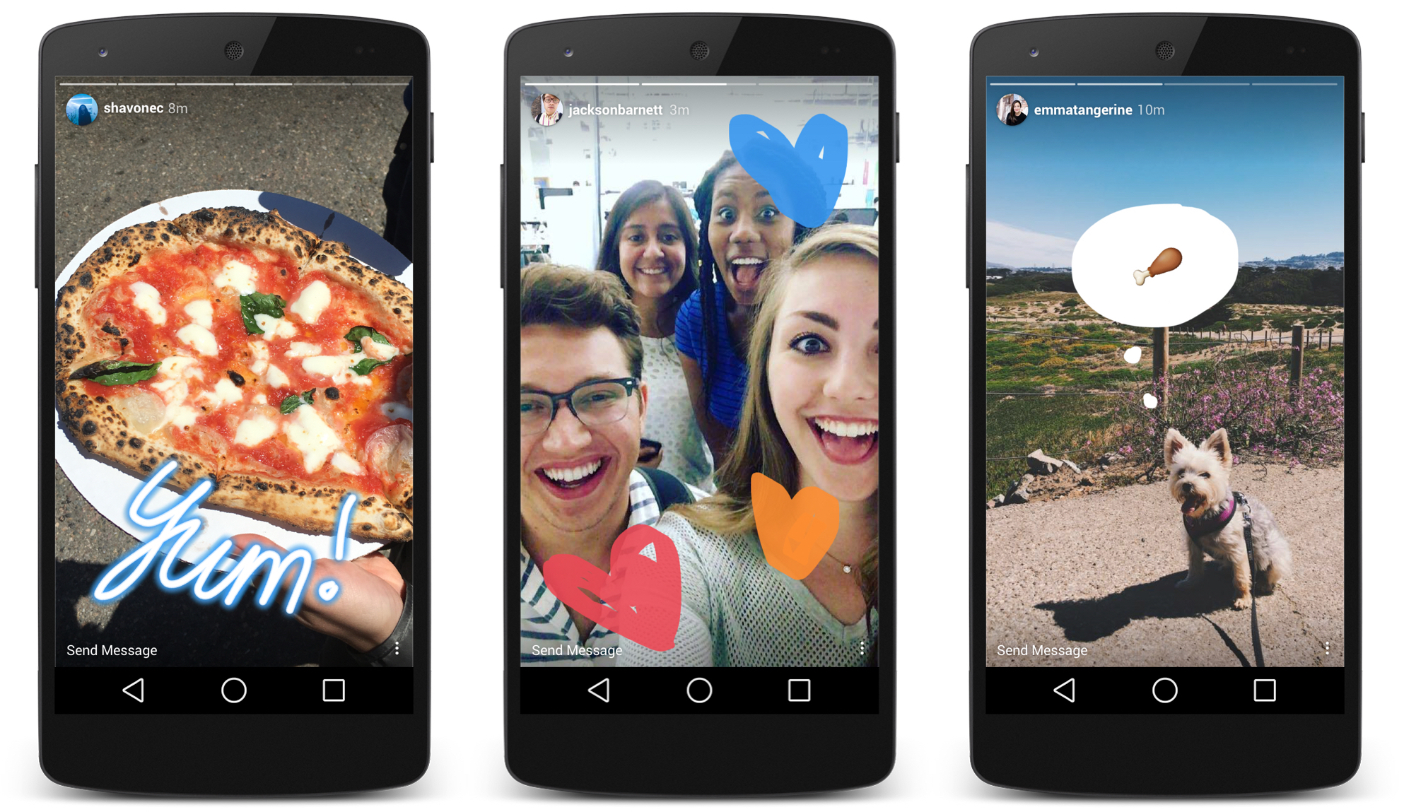
I analyzed Instagram and Snapchat stories to understand how they communicate 'moments' within a profile. Instagram's horizontal progress bars and auto-scrolling transitions became key inspirations.
Key Insights
- • Horizontal bars indicate "moment" count and length
- • Auto-scrolling provides a continuous viewing flow
- • Pie-timers offer alternative visual feedback
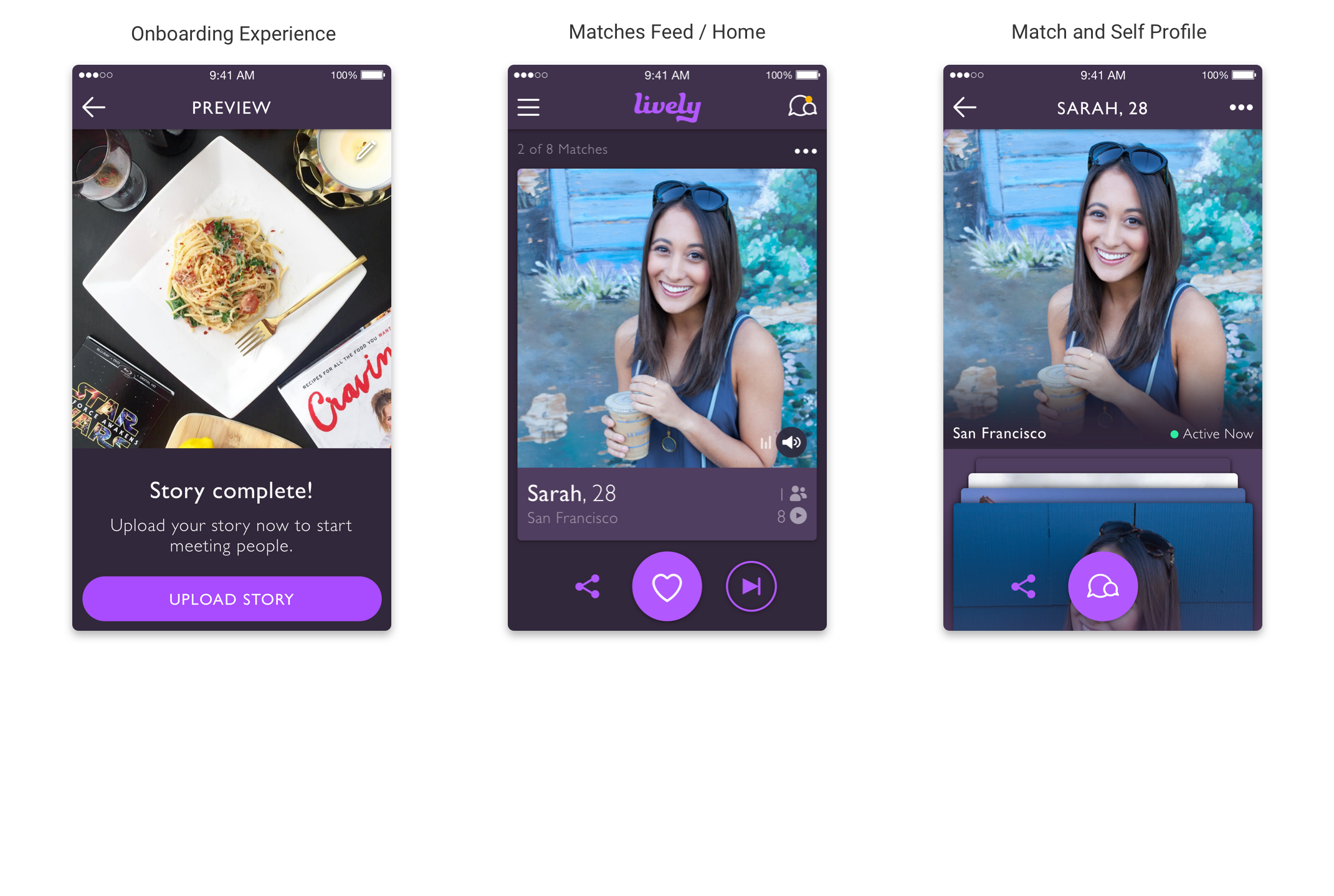
Experimenting with Layout
Iteration #1 & #3
Explored sidebar thumbnails to indicate moments. Found they distracted from the immersive video content.
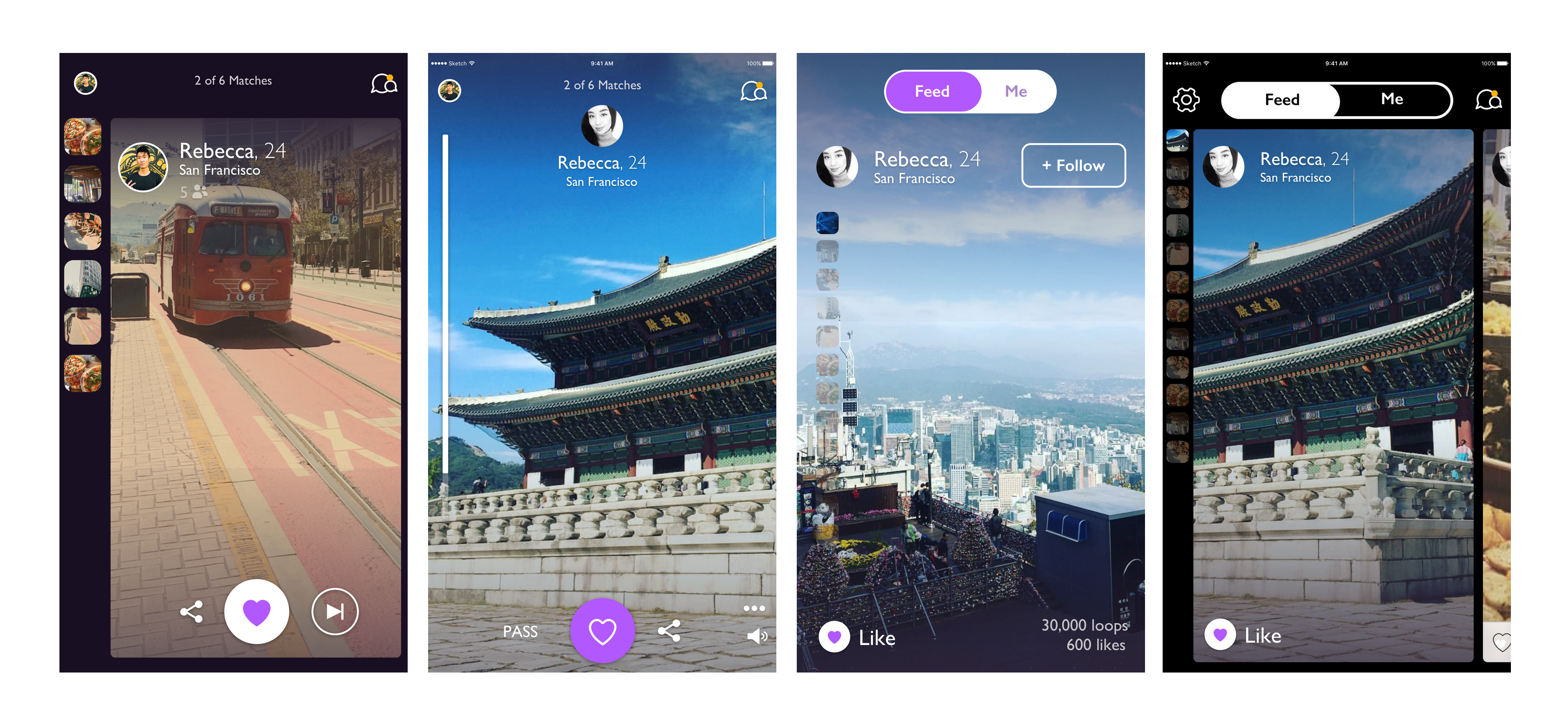
Iteration #2 (The Chosen One)
A full-screen, vertical scrollbar approach that lets the content breathe while providing subtle status indicators.
Iteration #4
A carousel 'peeking card' layout to clarify the queue of profiles waiting to be viewed.
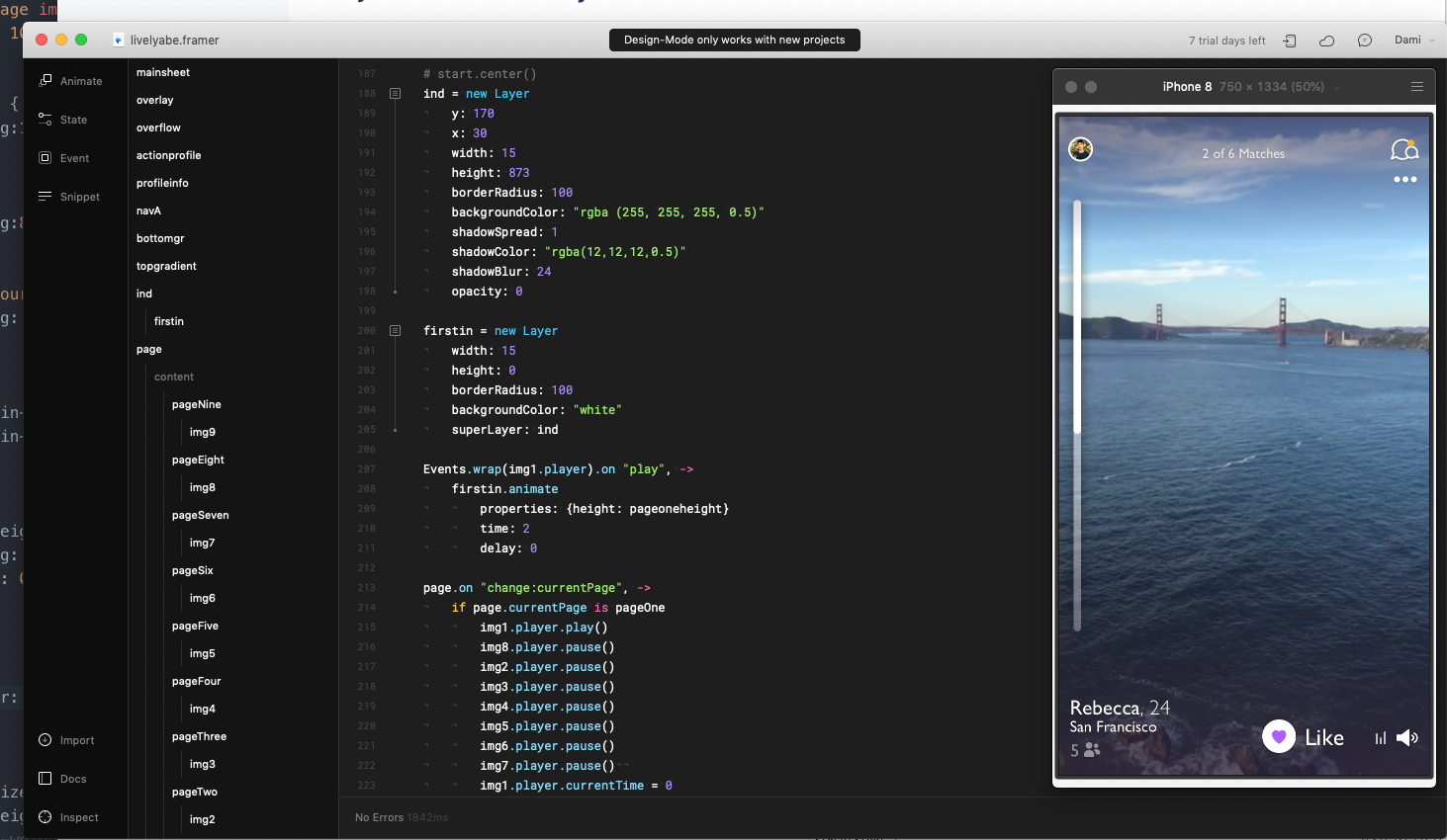
Framer Classic
I used Framer Classic's Page Component to test vertical scroll gestures. This allowed us to experiment with scroll speeds and transition curves that felt native.
Building with real .mp4 playback was critical for stakeholder buy-in, making the
prototype indistinguishable from a shipped app.
Interaction Demo
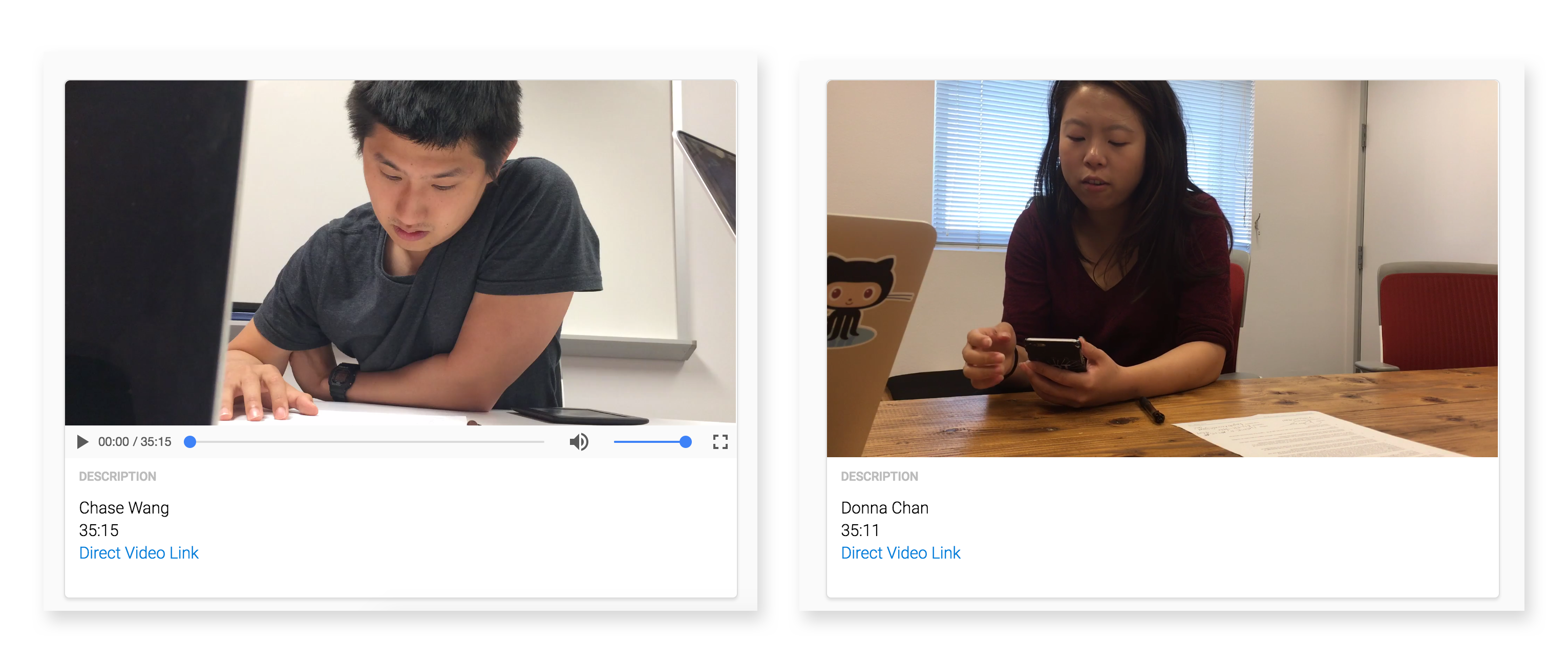
15 Interviews in 48 Hours
Since Lively was Bay Area focused, we invited 15 local users to the office. We discovered that while users preferred full-screen immersion, they wanted the "Pass" button to be less prominent to avoid a "negative atmosphere."
Result: Navigation was intuitive enough that we could remove explicit 'pass' UI in favor of gestures and subtle icons.
Accounting for Legacy
To support users with existing 1:1 videos, we implemented a background blur system—using a still frame from the video clip to maintain high performance without sacrificing the immersive 9:16 feel.