Lively Redesign Case Study

Project Background:

  • Lively is a video dating app that Zoosk launched earlier this year. I worked on designing the v2 of Lively.

My Role and Timeline:

  • I was not the initial designer on v1 of Lively but I worked on v2 as the sole designer. The project timeline was 2 weeks.

Project Goals:

  • Revamp home feed and all experiences to accommodate and emphasize vertical video.

  • Design an experience that doesn't degrade old user videos uploaded in 1:1 aspect ratio.

  • Making navigating between both profiles and individual profile content clear / intuitive for new users.

Project Tags and Software:

Sketch
Framer
iOS
UI Design
Interaction Design

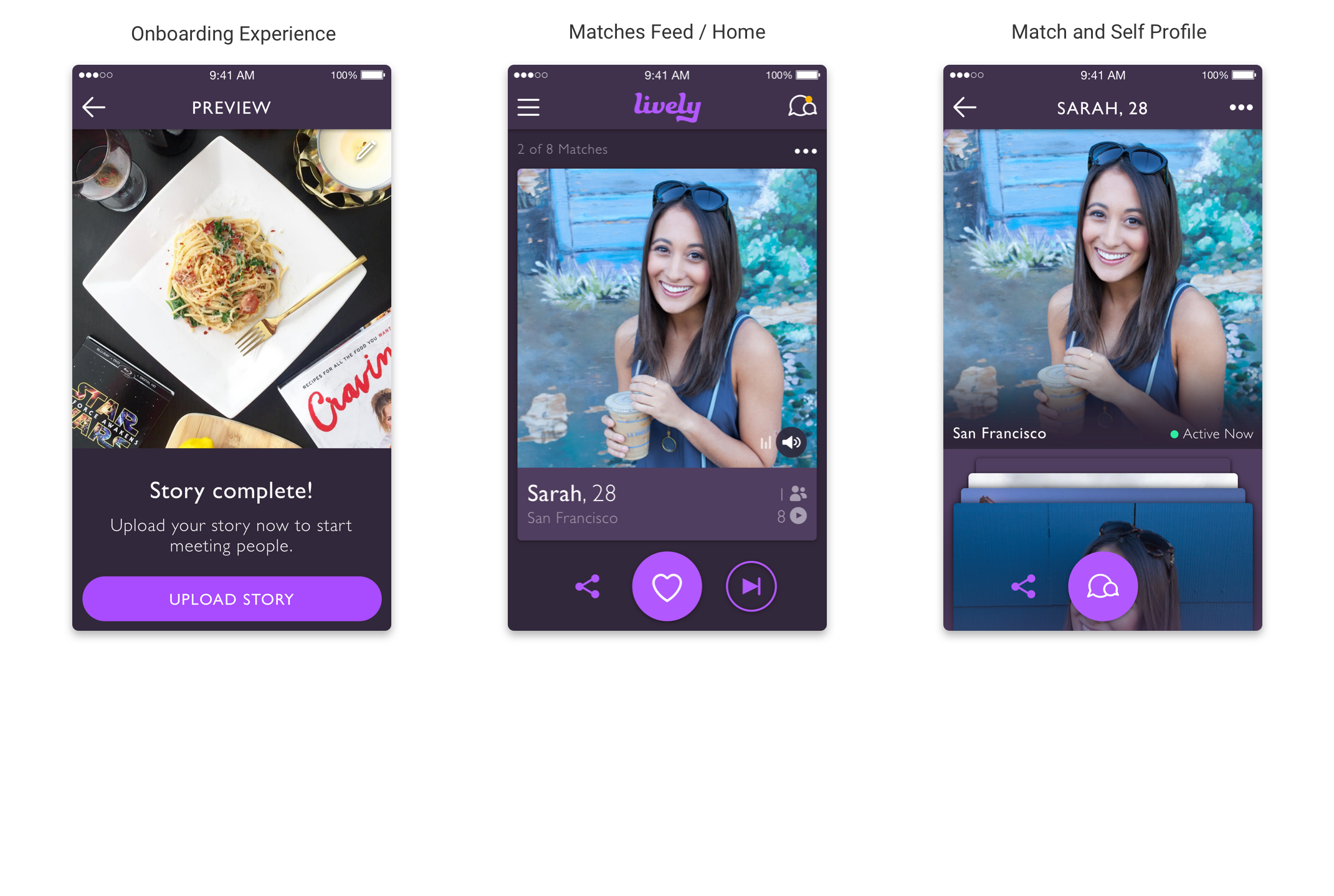
Define Project Objectives 

Identify which screens and flows in the current app need to be updated based on project objectives.

  • The main task of the redesign was to accommodate vertical video throughout the app. The previous videos in the app were using an aspect ratio of 1:1. 


  • Lively had launched prior to Snapchat Stories and Instagram Stories but the popularity of both apps is what inspired the Product team at Zoosk to integrate vertical video into the Lively app. Before making changes to the app screens we wanted to design an intentionally great user experience in Lively.


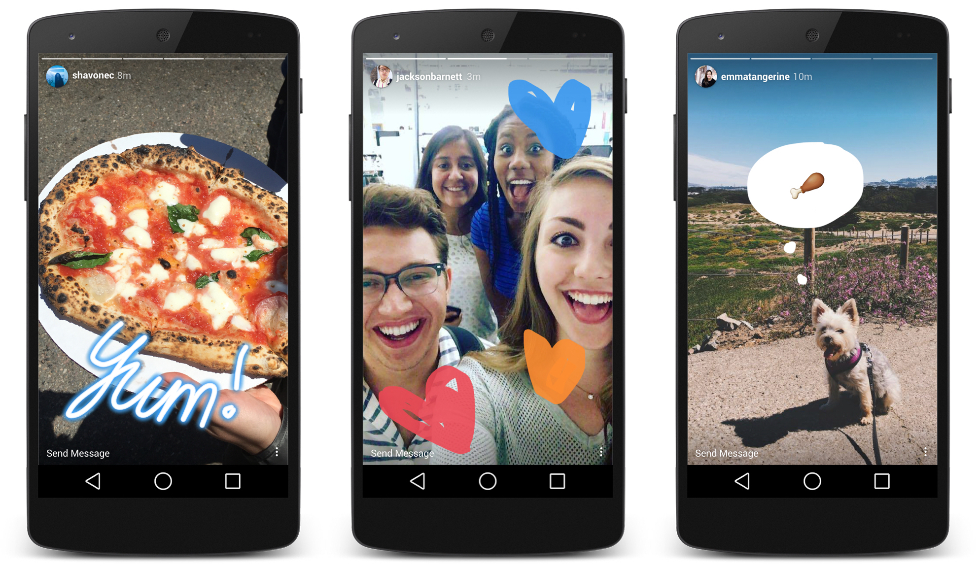
Lively Competitive Research

Researching and understanding the design of popular and similar apps can be a competitive advantage.


One of the first I did when trying to solve the design problems for this project was to look at how other applications similar to Lively solved similar problems. 

I download dozens of apps but some of the apps I tried were Snapchat and Instagram, specifically the Instagram Stories feature. I wanted to understand the design details that went into communicating the concepts of the next picture/video and the next person in Instagram stories and Snapchat stories. 

Instagram Stories Notes:

  • Horizontal bar on the top of the profile "story" that indicate how many "moments" in a story. The bar also animates based on the length of each "moment"

  • Auto scrolling to the next profile "story" after the previous profile "story" is completed.

  • Horizontal scrolling list on top of home feed to indicate how many stories there are to watch

Snapchat Notes:

  •  Circular pie timer to indicate how moments there are in a person's "story"

  •  Recently removed auto playing next profile "story" after the previous profile "story" is completed.
Both apps take a fairly simple approach to indicating the length of a story using subtle but also clear visual indicators. 

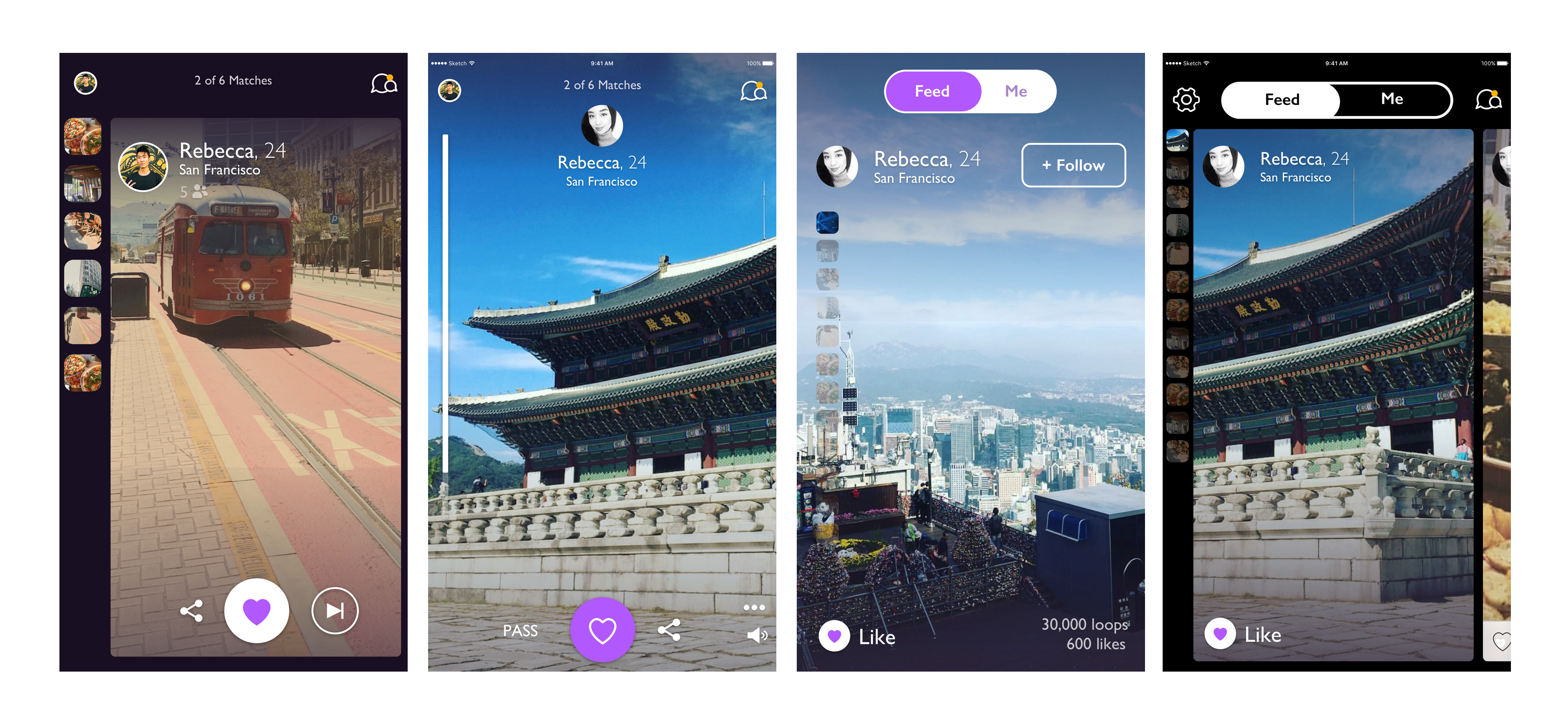
Lively Design Iterations

After doing some research I spent some time creating some design iterations of the home screen. 


I wanted to experiment with different layouts that had different approaches to navigating between profiles and content inside each profile.

Some context:
Lively is a video dating app - meaning users can create video profiles made up of stitched photos and video clips. Users can browse the profiles of others who meet their match preferences. They can choose to like a profile or pass on a profile.

Iteration #1:
 This mockup has thumbnails on the left side of the screen to indicate the moments in the current profile being viewed.

Iteration #2:

  •  This mockup is an immersive full screen with a vertical scrollbar that animates based on the which moment in the story is being viewed. The pass button on this mockup is also suppressed.
Iteration #3:
  •  This mockup is somewhat of a combination between the first and second mockup. It is full screen but also has thumbnails on the let side of the screen to indicate the number of moments in the current profile being viewed. The pass button has been removed from this mockup.
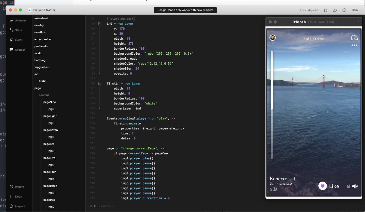
Iteration #4:
 The mockup is a carousel type layout where there is a peeking card for the next profile. There are also thumbnails on the left to indicate the moments in the profile story and the pass button has been removed.

After creating these iterations I then moved on to creating prototypes.

Lively Prototypes

I created a prototype in Framer Classic with videos that played and made the prototype feel like a real app.


After creating the iterations and presenting them to my stakeholders I narrowed down my designs to 2 main layouts. One layout is carousel type layout where each profile is a card and on the home screen it is clear that there is another profile card peeking to the right of the screen. On the left hand side of this design there is are thumbnails of the "moments" in the profile's story. The second layout is focused on being a full screen and immersive experience. I built these prototypes using Framer and they took about 2 days to complete.

I built these prototypes in Framer Classic for a few reasons:

1. Video playback support:

  •  While I could have just focused on designing the UI in software such as Sketch or Figma, I decided to utilize Framer Classic's video playback functionality. Framer Classic is supported by framer.js a custom javascript library that allows for quick prototyping. Framer is built on top of the web which means a number of "features" are built in and straightforward.
2. Built in Page Component
  •  I enjoy using Framer Classic because it has a number of built in components such as the Page Component. This component allowed me to nest each video into a full screen page that was within a container that could be scrolled vertically or horizontally.
I configured the page component to be scrollable vertically. That mean when a scroll gesture was made it would either scroll upwards or downwards to the corresponding page. I was able to experiment easily with the scroll speeds and create a scroll indicator that changed based on the page 

Prototyping with Framer Classic was the most high fidelity option at the time
 Creating high fidelity and realistic prototypes is an important part of a solid design process in my opinion. Framer Classic at the time on 2017 was the best prototyping software for designers. I could have attempted to make a similar prototype in Swift or Objective-C but the learning curve would have been too steep and the timeline to learn would have exceeded the project timeline.

Framer Classic was the perfect balance of high fidelity and fast to create. Creating these prototypes was an exciting exercise for me.  
 

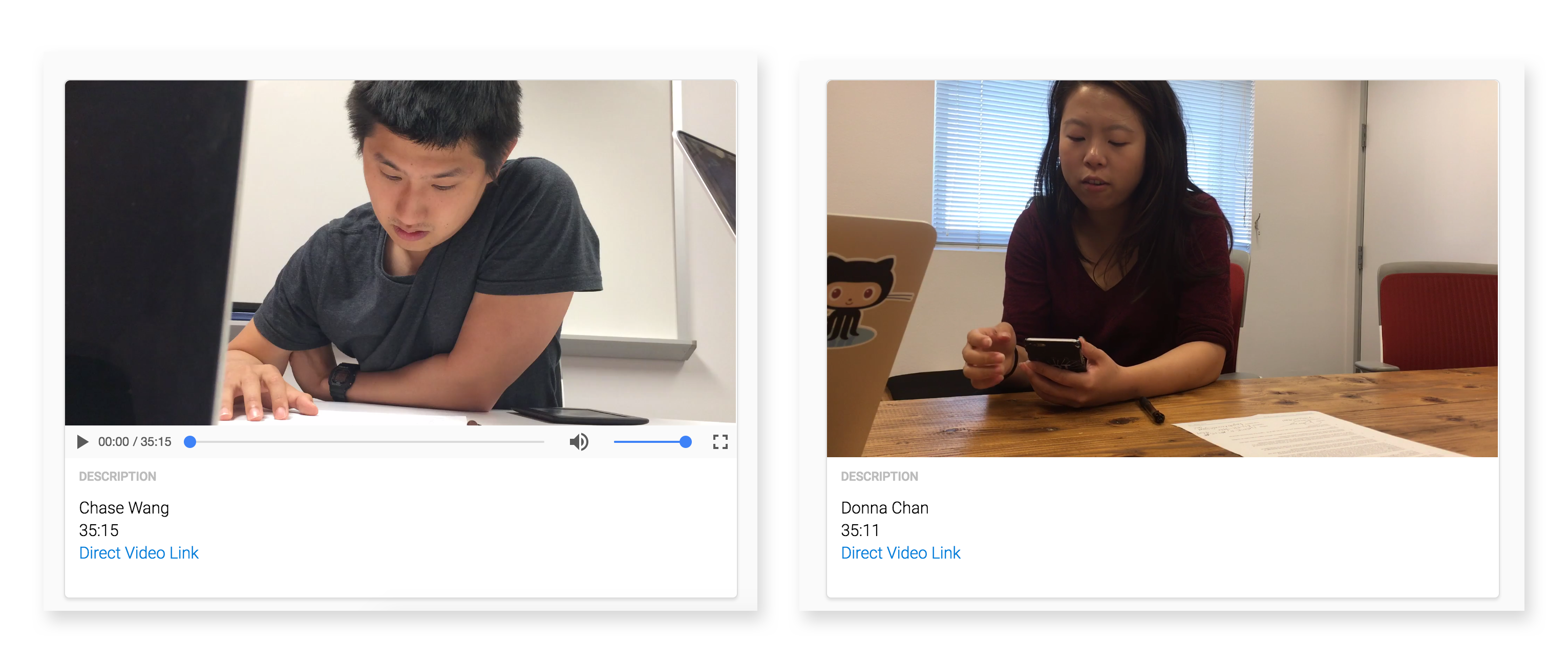
User Studies / Research

We conducted 15 user interviews in a span of 48 hours. Each interview was about 30 minutes.


After prototyping the designs, my stakeholders and I decided to run a very ad-hoc and informal user study. Since Lively is only available for users in the Bay Area we emailed some of our users and had 15 people come into the office to try out some prototypes, answer some questions and tell us how they think the app could be improved. Each participant was given a $100 Amazon.com gift card for their time.

During the studies we focused on asking people about navigating between profiles and content in the app, the pass button and some more experimental features that the stakeholders are thinking of adding to Lively.

I created an internal webpage for other members of the product team at Zoosk to watch the user interviews. In addition to this I created a summary document that went over the highlights of each interview. 

Shipping the app

Insights from user research
After the user study it was clear that users wanted the pass button to be on the left side of the screen but they didn't want it to be very prominent because it created a "negative atmosphere" within the app. 

Users also preferred the full screen experience vs the carousel like layout. An insight gained from the user study was that a lot of the people we talked to wanted profile pictures to be the indicator for the amount of matches are in the "queue" for the day. 

Users were able to understand that they could scroll up and down between the moments in a story. Navigating between profiles wasn't an issue because when a user presses on the like or pass button the screen automatically navigates.

Accounting for existing content:
The original version of the app was cropping user uploaded videos and images to be 1:1 aspect ratio. This was the case because the profiles were designed to have 1:1 aspect ratio content. But since the app was switching to 9:16 aspect ratio (full screen) the new design needed to account for users with existing content prior to the redesign.

The design solution to this was to have a blurred video in the background of videos that were 1:1 aspect ratio, then center the actual video on top of the blurred video layer. In the shipped version of the app the blurred layer ended up being a still image from the video clip. This modification was made to speed up the Lively app performance.