MakeUI Case Study
Project Background:
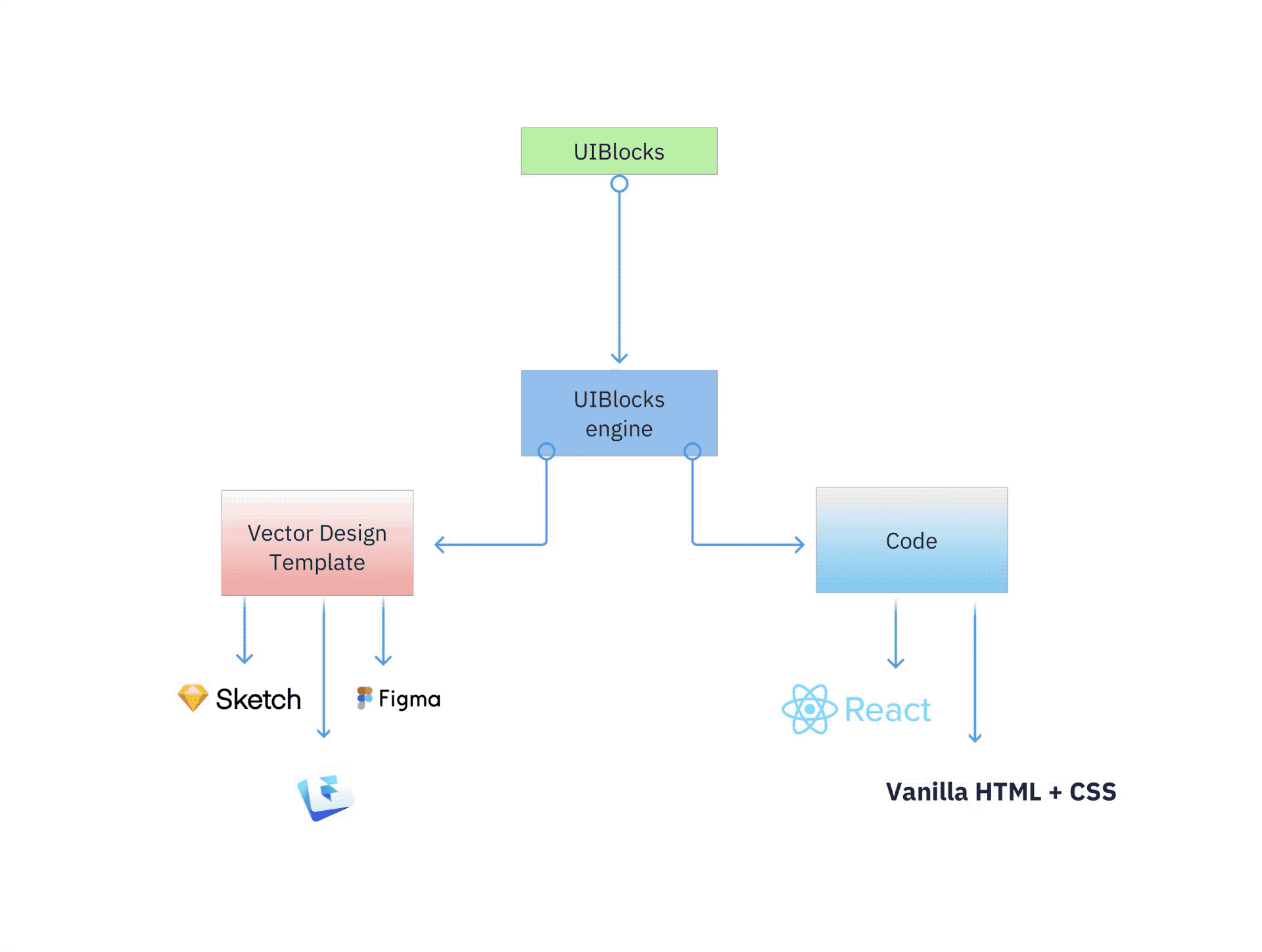
To help take the heavy lifting out of your digital design process, I created a tool that generates custom Sketch UI kits based on custom styling tokens.
My Role and Timeline:
I created this project because I found myself starting projects with the same boilerplate Sketch design file. I wanted to automate the styling of the boilerplate template. I eventually found out I could modify the JSON contents of a .sketch file and that was the beginning of the MakeUI project.
I started initial work on this project in April of 2018 and I launched an initial app called Button States in May of 2018 to validate a need in the market for customizable UI elements. Button States only had one customization for corner radius but I managed to get 34 sales ($5 per download) with no paid marketing.
↳ Color customizations
↳ More components to customize
Software and Highlights
Getting Started
Create a specification document
I started the MakeUI project by defining the project requirements. I created a specifications document that went over how the app works in the form of words, diagrams and prototypes.
After creating the spec I worked on creating a to-do list that went over the design file that I would need to create. This design file would need to consistent of base stylings for the following:
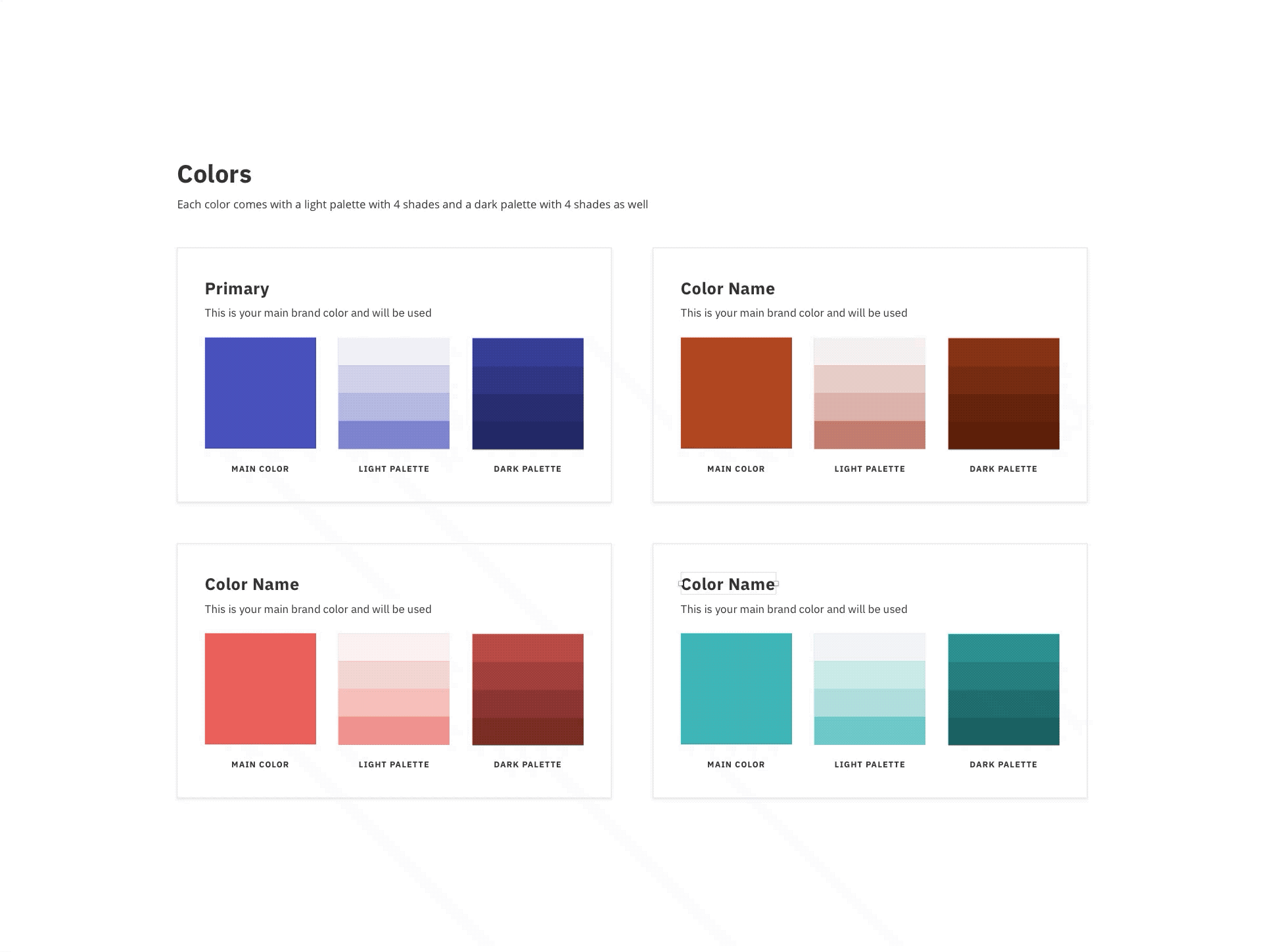
↳ Colors
↳ Typography
↳ Iconography
↳ Web Components
I spent time researching common design system components and styling rules to hep inform how I put together the base MakeUI design kit.
Design Process
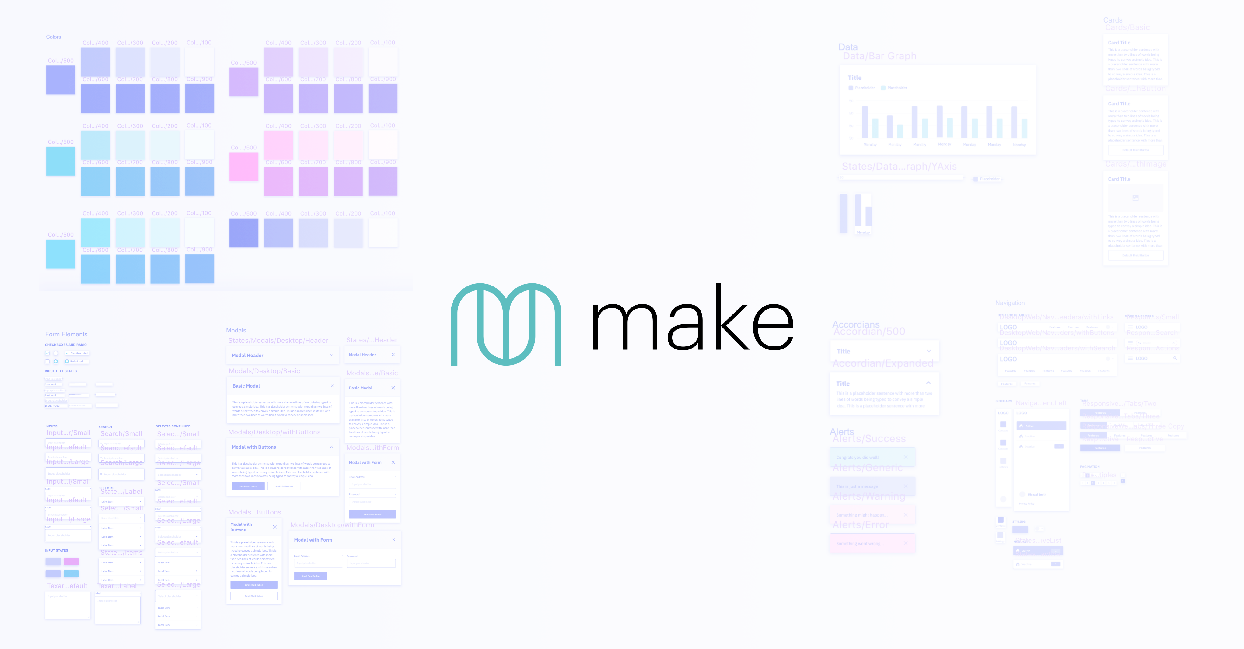
Building a base UI kit from scratch
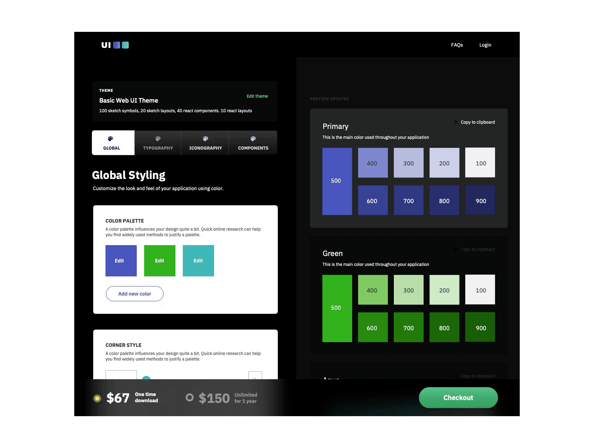
While designing MakeUI's base UI kit I started by creating color styles and symbols of colors layers in sketch. After completing that step I was able to create component layers that are made up of main theme color styles and symbols. That means if the color styles are updated then the component colors will also update.
Once the color foundation was completed I was then able to move onto typography. I created text styles in sketch for headings, paragraph text and font styling for buttons and forms. Similar to the color styles, text styles allow for one modification to globally apply to multiple elements that can be nested within other elements (complements).
↳ Accordians, Alerts, Breadcrumbs, Buttons, Carousels,
↳ Form Elements such as checkboxes + radio inputs, input fields, search and dropdowns.
↳ Modals, Navigations elements such as sidebars and headers, pagination, popovers and tables
Launching MakeUI
Iterations of the styling editor
After designing the base theme, it was time to think about users would be able to edit and modify their styling. Building an editor with a preview on the right hand panel was the ideal layout I wanted to build. But due to technical limitations I wasn't able to import the sketch components in the web to allow for customizations and previewing at the same time.
Post Launch Metrics
I launched MakeUI by posting it on Product Hunt and Designer News on January 15th, 2019. I managed to get a solid amount of traffic on the website without any paid marketing.
I managed to get 37 customers and 40% of those customers purchased the unlimited download license. I was able to gather feedback from the customers of MakeUI 1.0. The #1 request is for component styling preview. This means being able to see the customizations made to global styling and how it affects a component's styling in real time.
Honourable Mention and Mobile Excellence award on Awwwards.com