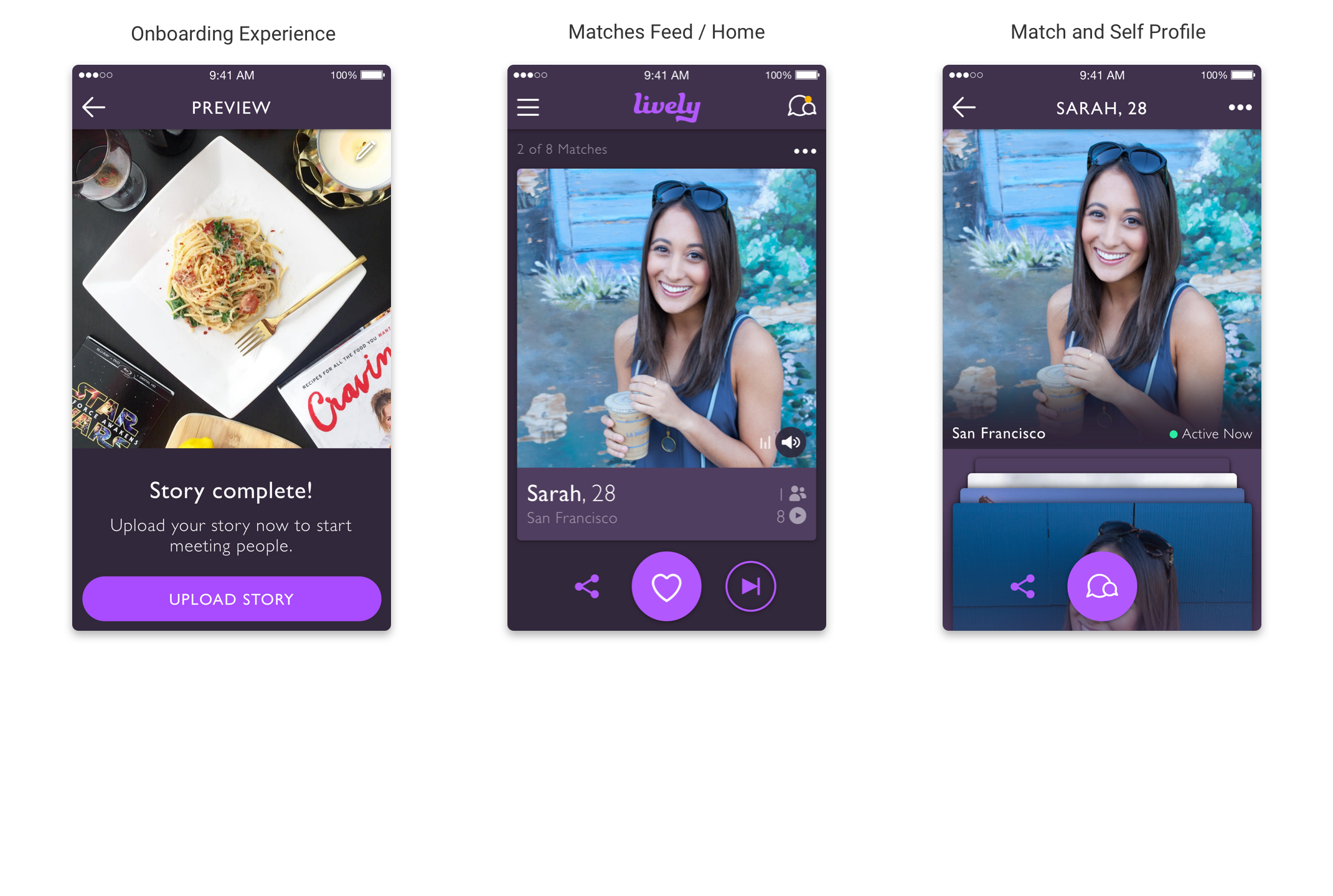
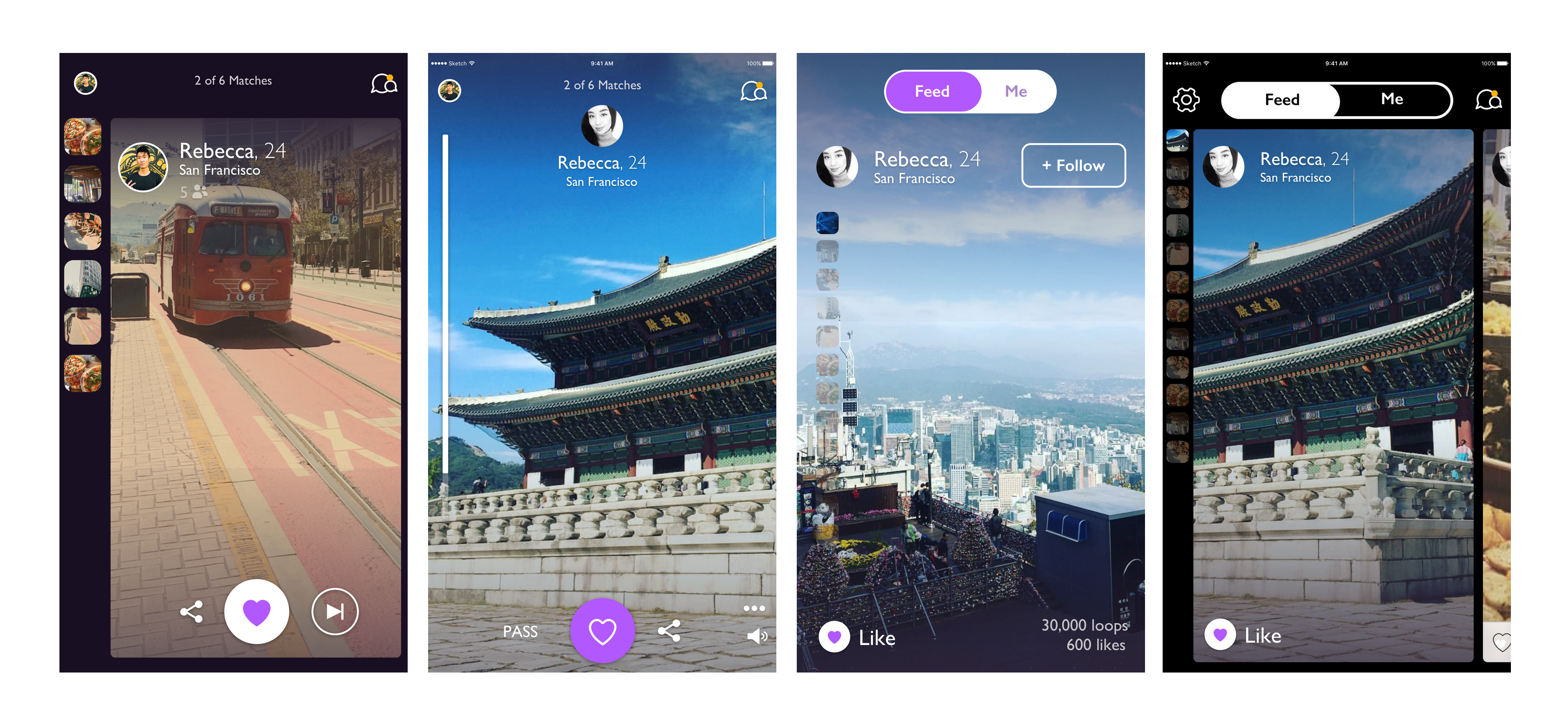
Lively is a video dating app that Zoosk launched earlier this year. I worked on designing the v2 of Lively.
I was not the initial designer on v1 of Lively but I worked on v2 as the sole designer. The project timeline was 2 weeks.
Onboarding:
Matches / Home Feed:
Match and Self Profile:
One of the first I did when trying to solve the design problems for this project was to look at how other applications similar to Lively solved similar problems. Some of the apps I tried were Snapchat and Instagram, specifically the Instagram Stories feature.
Instagram Stories Notes:
Snapchat:
After doing some research I spent some time creating some design interations of the home screen. I wanted to expermiment with different layouts that mainly focused on addressing navigating between profiles and content inside each profile.
Iterations - left to right:
After creating the iterations and presenting them to my stakeholders I narrowed down my designs to 2 main layouts. One layout is carousel type layout where each profile is a card and on the homescreen it is clear that there is another profile card peeking to the right of the screen. On the left hand side of this design there is are thumbnails of the "moments" in the profile's story. The second layout is focused on being a full screen and immersive experience. I built these prototypes using Framer and they took about 2 days to complete.
After prototyping the designs, my stakeholders and I decided to run a very ad-hoc and informal user study. Since Lively is only available for users in the Bay Area we emailed some of our users and had 15 people come into the office to try out some prototypes, answer some questions and tell us how they think the app could be improved. During the studies we focused on asking people about navigating between profiles and content in the app, the pass button and some more experimental features that the stakeholders are thinking of adding to Lively.
After the user study it was clear that users wanted the pass button to be on the left side of the screen but they didn't want it to be very prominent because it created a "negative atmosphere" within the app. Users also preferred the full screen experience vs the carousel like layout. An insight gained from the user study was that a lot of the people we talked to wanted profile pictures to be the indicator for the amount of matches are in the "queue" for the day. Users were able to understand that they could scroll up and down between the moments in a story. Navigating between profiles wasn't an issue because when a user presses on the like or pass button the screen automatically navigates.